ShopDreamUp AI ArtDreamUp
Deviation Actions


Description
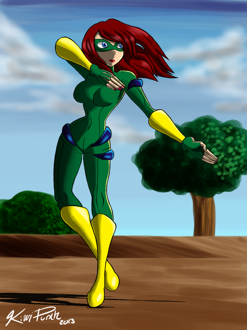
Introducing a super-heroine named Wildrose! She has the power of plant manipulation. Her suit is made of bullet-proof plant fibers that she can freely manipulate and turn into any shape such as a shield, sword, etc. Her power of plant-manipulation in terms of other plants in the area only works when she is touching the plant. In order to uproot it, use it, etc. she has to be touching it. She is weak to fire, over-saturation of water, and weedkiller. Jenine Spencer took up several years of karate and martial arts training before taking up her new job as a superhero, and as it turns out, she is a lot more agile than first thought. Her arch-nemesis is at this point undecided.
The picture itself is pretty bare-bones, so sorry about that. As for shading, I went for something simpler, and in my opinion, it works.
The picture itself is pretty bare-bones, so sorry about that. As for shading, I went for something simpler, and in my opinion, it works.
Image size
864x1152px 747.79 KB
Comments21
Join the community to add your comment. Already a deviant? Log In
(The last time I actually critiqued was like...4 years ago lol... so I will give this my best) The pose she has is really nice. I notice the shading on her hands were given a lot of attention, which conveys the light source really nicely. The body was given a lot of attention, but I feel that the background was somewhat neglected. If you didn't want to give much attention to a setting you could make the background just a solid color.
You have a nice handle on how shadows are casted on a body and shapes. The highlights and refection lights were in the right place as far as I know, but maybe it could use a little fine tuning. Something to consider, maybe experiment with cell shading and planes/surfaces because it can bring a difference style that will give you a more comic-like look.
Now as for the anatomy, it leans towards anime-like features; however, some body parts do seem proportional compared with other parts, which is good. The key to having good anatomy is to be consistent with how each body part compares with another. For example, arm, when it is relaxed at the side, typically has the wrists line about where the pelvis is. Look up the "the golden face" It gives you an idea of how geometry and measurement plays a lot into realism and beauty; it is really interesting. I warn however don't try to achieve "perfection". Imperfection is perfection.
This is a nicely done character and it is good see a display of a understanding of lighting. Even though the background should have gotten the same attention it doesn't take away from the actual subject of the work. good job ^_^