ShopDreamUp AI ArtDreamUp
Deviation Actions


Suggested Deviants


Suggested Collections


You Might Like…


![[ Contest entry ] Sugar Paradise Summer](https://images-wixmp-ed30a86b8c4ca887773594c2.wixmp.com/f/75ce02d2-d9d8-4c85-8d2a-04674b53894a/d54abiz-37e5ef00-7d55-4a51-b4fc-6eb4bdd4a4dd.png/v1/crop/w_184,h_184,x_0,y_0,scl_0.092/__contest_entry___sugar_paradise_summer_by_kitsunerenachan_d54abiz-92s-2x.png?token=eyJ0eXAiOiJKV1QiLCJhbGciOiJIUzI1NiJ9.eyJzdWIiOiJ1cm46YXBwOjdlMGQxODg5ODIyNjQzNzNhNWYwZDQxNWVhMGQyNmUwIiwiaXNzIjoidXJuOmFwcDo3ZTBkMTg4OTgyMjY0MzczYTVmMGQ0MTVlYTBkMjZlMCIsIm9iaiI6W1t7ImhlaWdodCI6Ijw9NjAwIiwicGF0aCI6IlwvZlwvNzVjZTAyZDItZDlkOC00Yzg1LThkMmEtMDQ2NzRiNTM4OTRhXC9kNTRhYml6LTM3ZTVlZjAwLTdkNTUtNGE1MS1iNGZjLTZlYjRiZGQ0YTRkZC5wbmciLCJ3aWR0aCI6Ijw9NjAwIn1dXSwiYXVkIjpbInVybjpzZXJ2aWNlOmltYWdlLm9wZXJhdGlvbnMiXX0.7jkF3qf4BCYRZw_rx22mbA4Km5rvuhYGF_zu9qJ2Zn0)
![[ Contest entry ] Sugar Paradise Summer](https://images-wixmp-ed30a86b8c4ca887773594c2.wixmp.com/f/75ce02d2-d9d8-4c85-8d2a-04674b53894a/d54abiz-37e5ef00-7d55-4a51-b4fc-6eb4bdd4a4dd.png/v1/crop/w_92,h_92,x_0,y_0,scl_0.046/__contest_entry___sugar_paradise_summer_by_kitsunerenachan_d54abiz-92s.png?token=eyJ0eXAiOiJKV1QiLCJhbGciOiJIUzI1NiJ9.eyJzdWIiOiJ1cm46YXBwOjdlMGQxODg5ODIyNjQzNzNhNWYwZDQxNWVhMGQyNmUwIiwiaXNzIjoidXJuOmFwcDo3ZTBkMTg4OTgyMjY0MzczYTVmMGQ0MTVlYTBkMjZlMCIsIm9iaiI6W1t7ImhlaWdodCI6Ijw9NjAwIiwicGF0aCI6IlwvZlwvNzVjZTAyZDItZDlkOC00Yzg1LThkMmEtMDQ2NzRiNTM4OTRhXC9kNTRhYml6LTM3ZTVlZjAwLTdkNTUtNGE1MS1iNGZjLTZlYjRiZGQ0YTRkZC5wbmciLCJ3aWR0aCI6Ijw9NjAwIn1dXSwiYXVkIjpbInVybjpzZXJ2aWNlOmltYWdlLm9wZXJhdGlvbnMiXX0.7jkF3qf4BCYRZw_rx22mbA4Km5rvuhYGF_zu9qJ2Zn0)


Featured in Groups


Description
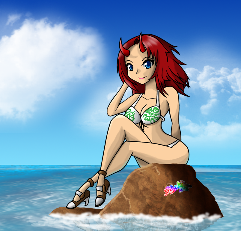
If there is anything that can be done to improve this piece, let me know IMMEDIATELY! Like I keep saying, DO NOT FAVE AND RUN!!!
I don't feel too good about the ocean, though...If anyone has any suggestions or tutorials for me, that would greatly be appreciated! I tried using my Goggle-fu to look for ocean surfaces done in photoshop, but erm...Well, you get the idea...
Anyways, the character in question is actually the protagonist of Calamity. Figured I might as well start drawing some more things in regards to the game, since it is something I'll be making in the future. She works as a model to pay her rent and to take care of her 8 year old sister, since her mother passed away. She is 18 years old, loving, and caring, but has a short fuse at times. She has a long-time girlfriend named Leah. She is a half-demon (sounds Mary Sue-ish...Damn...I should really change that), however, her powers only come out when she is fighting, and since she hates fighting...Well...Let's just say her demon side only comes out when she feels threatened. Over the course of Jillian's story, she learns to control her other self at will, switching between her two forms. I'll have to draw her in her other form soon.
Just so you know, I found some really great brushes from:
[link]§ion=&global=1&q=cloud+brushes#/dwnpyn
Unfortunately, I tried drawing clouds many different times for this pic, but nothing seemed to work. I was having opacity issues, program issues, etc. Hell, even finding a damn tutorial turned out to be a pain in the ass! Thanks again,
Image size
804x768px 700.59 KB
Comments41
Join the community to add your comment. Already a deviant? Log In
Great job overall, but since you asked, I'll nitpick a little. Individually, I like what you did with the rock, the figure, and the background/water. However, all together they look really awkward and out of place due to the drastically differing styles and textures. I feel you could make the piece work better if you changed the way the rock was done, and make it more in line with the character, but thats your choice.
I like the pose and the little details and the shading on the character. The anatomy seems a bit awkward though, but that'll come with practice")
All in all, it could use some cleaning up, but it's a lovely work nonetheless!
I like the pose and the little details and the shading on the character. The anatomy seems a bit awkward though, but that'll come with practice
All in all, it could use some cleaning up, but it's a lovely work nonetheless!